- Outdoorsy
My role
- Design System Designer
Overview
In this case study, I’ll walk you through my work on the Bonfire Design System for Outdoorsy, highlighting key processes and design decisions.
What is Outdoorsy?
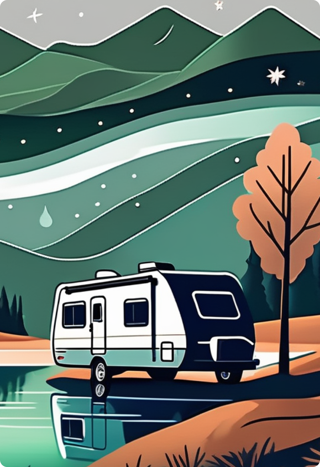
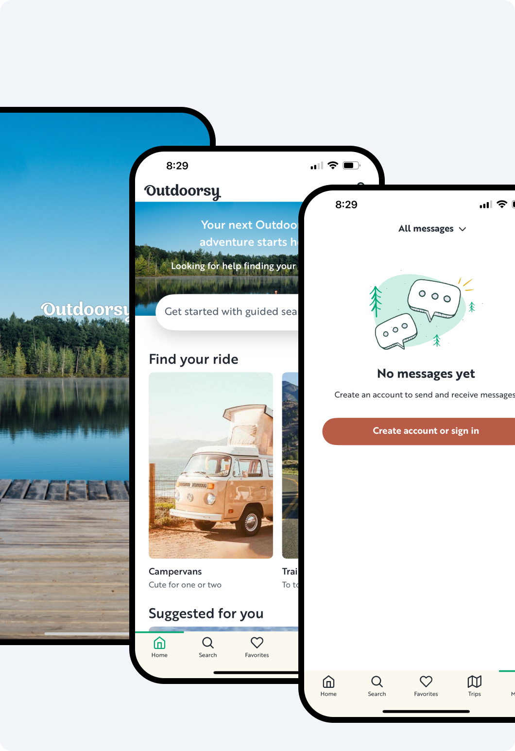
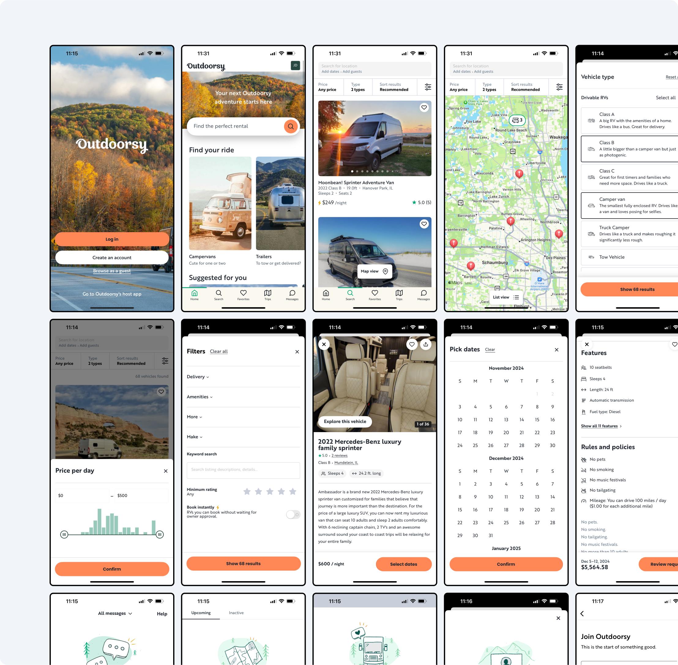
Outdoorsy is the largest RV marketplace for renting RVs. It connects local RV motorhomes and camper-van owners with people who want to rent them. Outdoorsy website and mobile app allow guest users to find the perfect RV, book it and hit the road while RV owners can easily create RV listings, accept new bookings and earn cash.
Problems
At Outdoorsy, things move faster than the Flash. With multiple teams and parallel development cycles, it is difficult for designers to be constantly aligned and consistent among the teams.
Designers used to rely heavily on multiple internal UI kits which were not regularly updated or maintained. As a result, they inherited a lot of design debt and disparity across products and platforms.
Goals
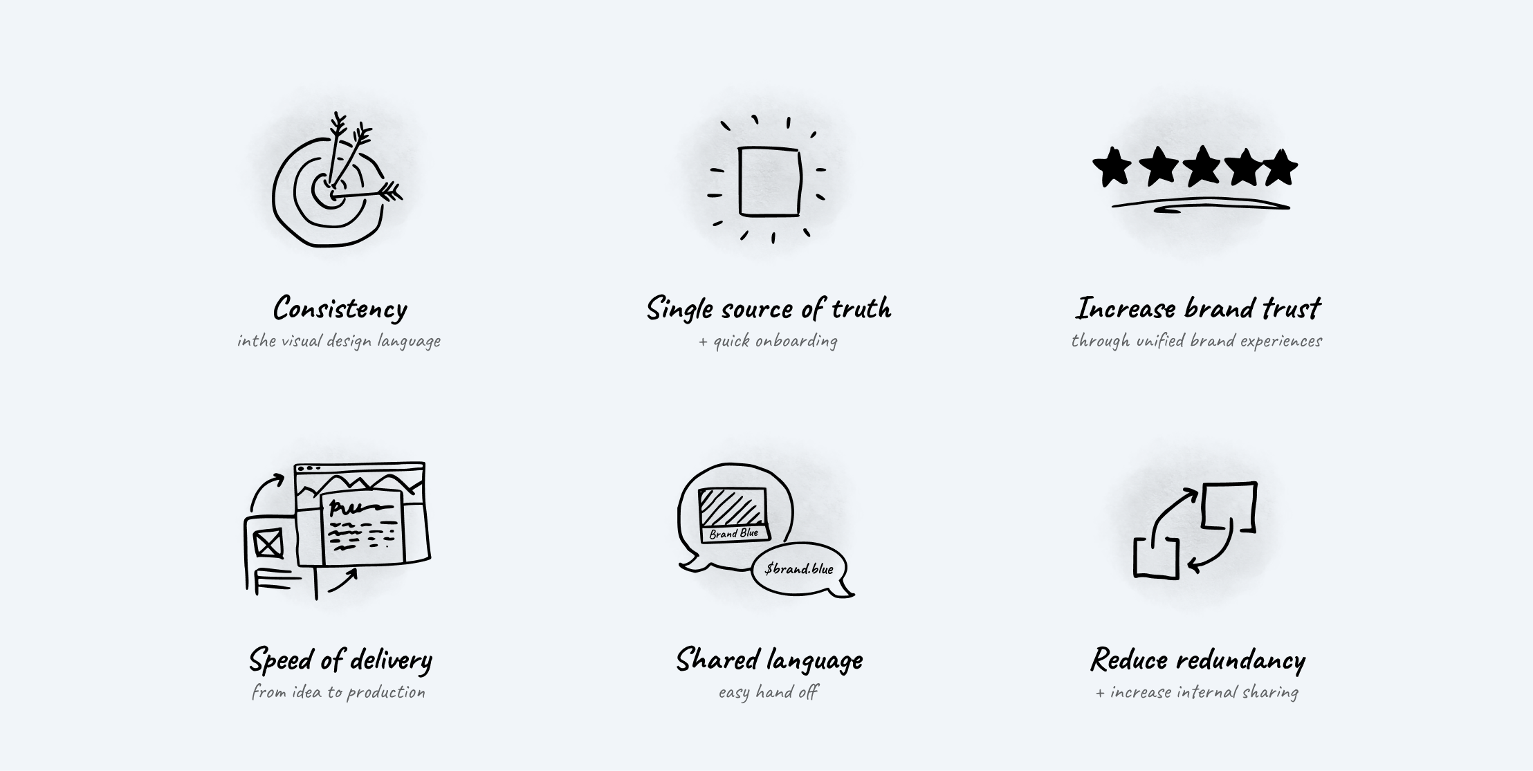
The primary objective was to create a comprehensive design system that could effectively resolve several key challenges.
Approach
At the beginning of the project, Outdoorsy had two products: Outdoorsy renting products for Guests (Web, iOS, Android) and Outdoorsy admin panel (Web only). Those products had very little in common. They were visually inconsistent and looked like they belonged to different companies.
I started with the overall architecture of the system. Following (but adjusting) the famous Brad Frost’s Atomic Design methodology.
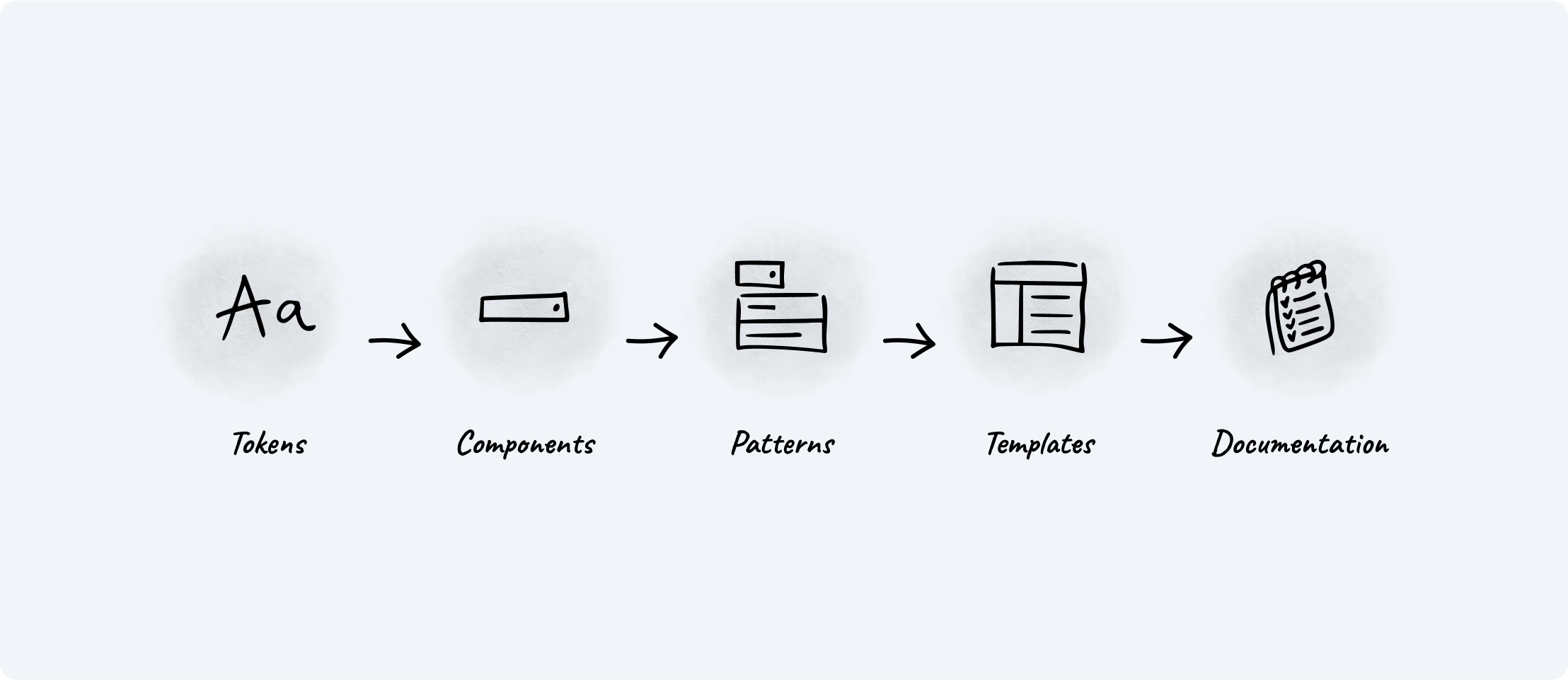
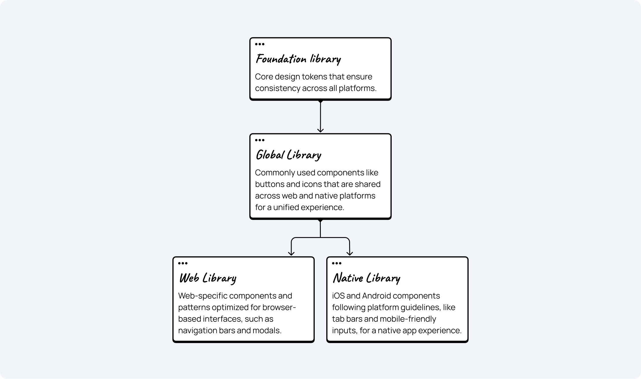
Figma Structure
From Figma libraries perspective, I came up with the structure.
The challenge was that each platform (web and native) had its own specific to platform components, even though components can be used across the products.
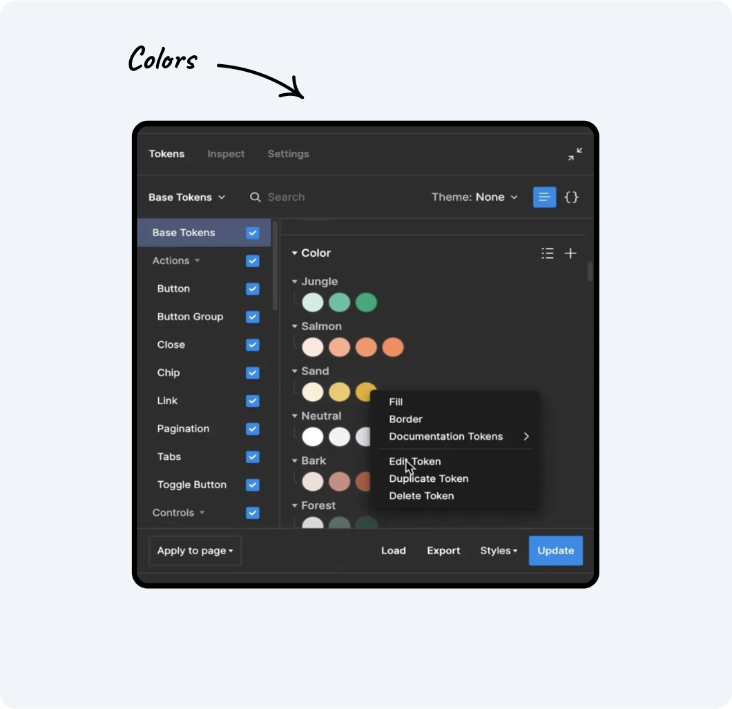
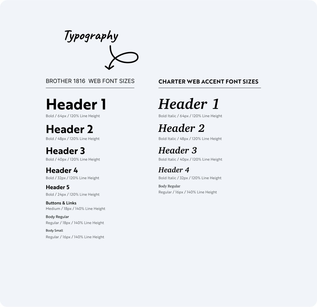
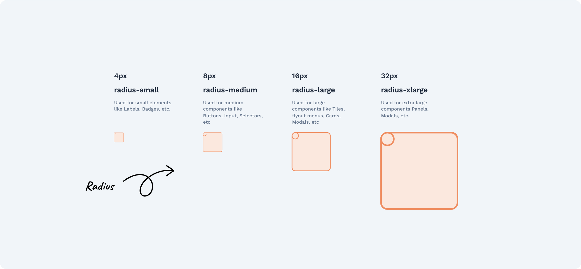
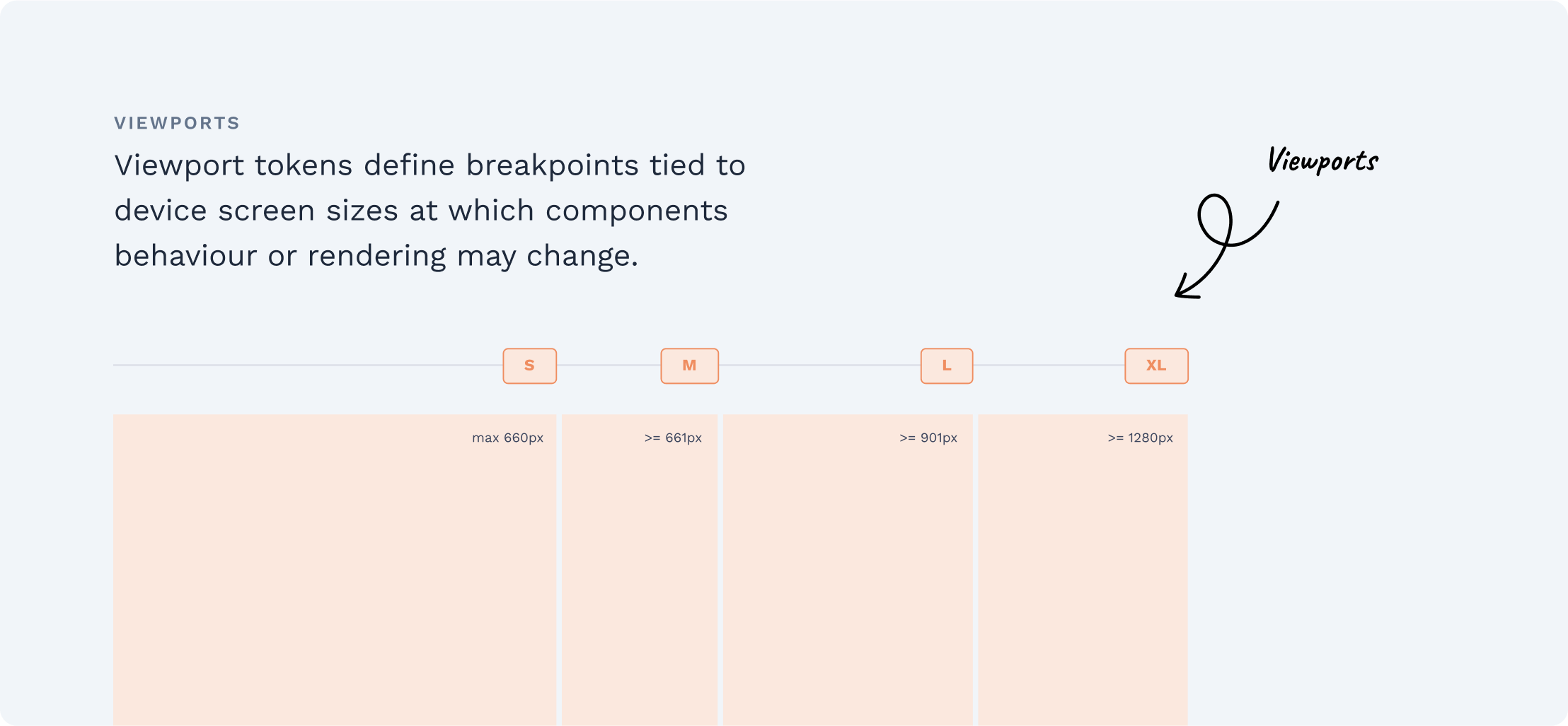
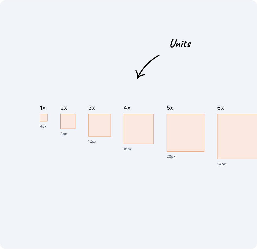
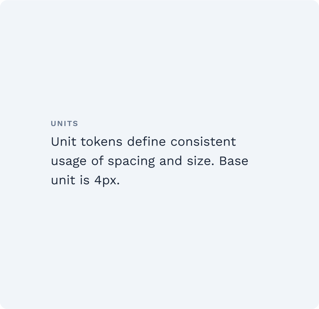
Design tokens
When the architecture was defined, I started building the foundation of the Design System or Design tokens.
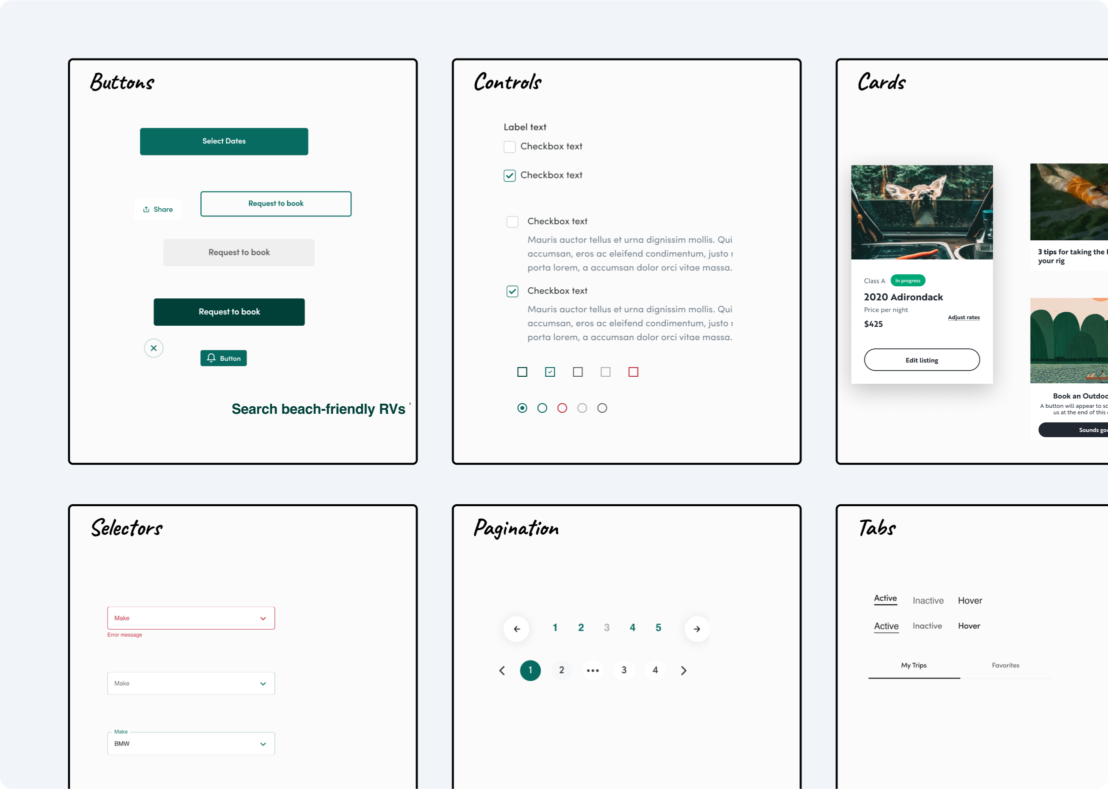
Components: Design process
When tokens were defined I started building components one by one. Every component requires a lot of collaboration between designers and developers. If I could simplify the design process it would look like this:
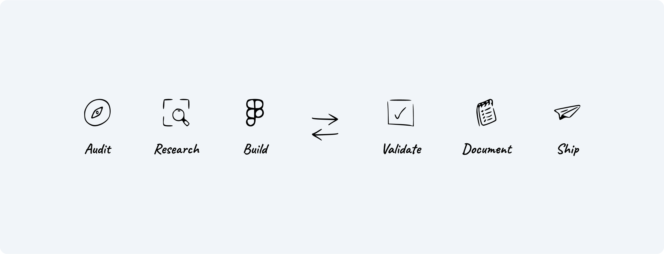
Audit
I usually start with auditing the existing design to simply learn the current product:
- collect a bunch of screenshots across the products to understand the use cases
- reveal inconsistencies
- highlight the issues: usability, accessibility, legal, etc.
Research
Then I go and look at the other Design systems. I do an external audit:
- learn about the specific component and its best practices
- learn how other companies deal with common issues

Build
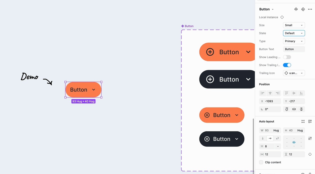
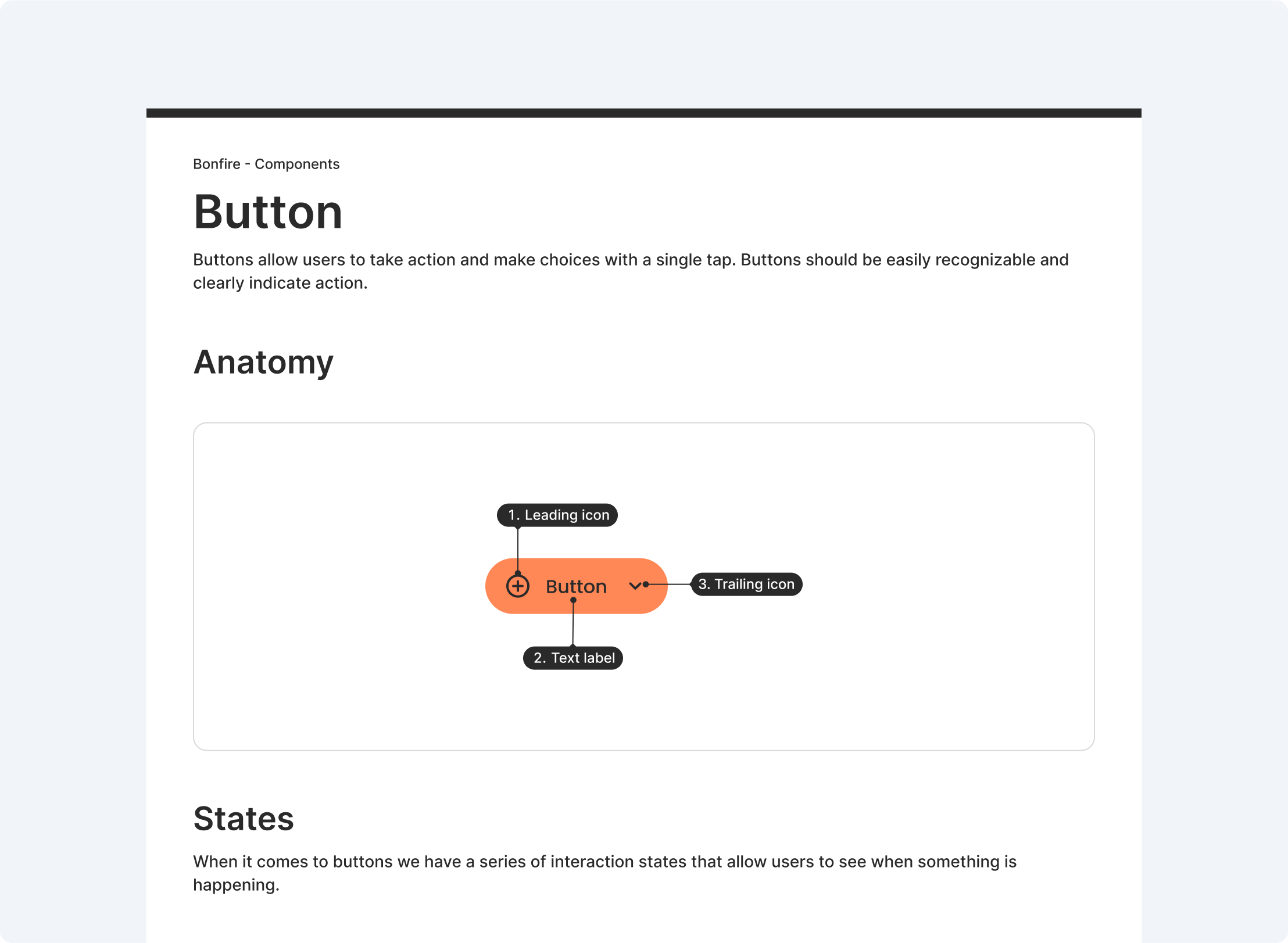
The next step is to build the component, which is my favorite part. I leverage Figma’s component properties to create a robust, flexible, and, most importantly, easy-to-use component that aligns seamlessly with code implementation.
Validation
After a component is built, it needs to be validated. Usually, I apply it to different scenarios and set up a design critique session to get designers’ and developers’ feedback and to make sure I am not missing some edge cases.
Document
The next phase is to document all the knowledge. We documented the Outdoorsy design System in Zero Heights. Usually include every detail in the documentation:
- definition
- anatomy
- properties
- best practices
- etc
Present
The final step is a presentation. Not everybody has an opportunity to participate in design critique sessions or follow all the changes that the design system team has made. That’s why it’s important to communicate and present the design system to a larger audience: developers, project managers, and designers.
Outcomes
As a result, 4 Figma libraries were created and set up for future use. These libraries contain 8 design tokens and 15 components that were documented in Zero Heights to be used by designers, developers, and other users.
